Basic Statistics
The first part of the dashboard contains the following charts:
-
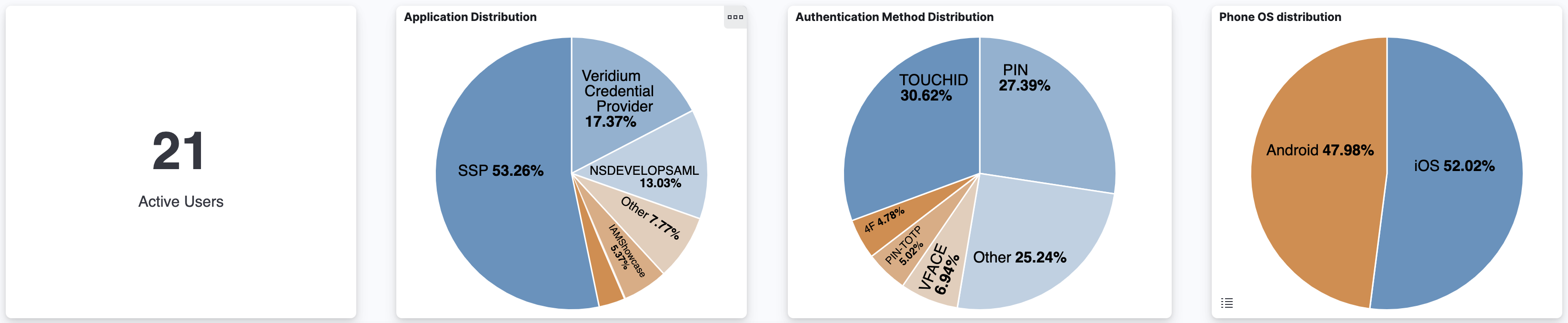
Active users shows the number of unique user identities that started an authentication session in the time frame specified by the dashboard.
-
Application distribution is a pie chart which provides an overview of how many authentication sessions were created using each application.
-
Authentication Method distribution is a pie chart which shows a overview of how many authentication sessions were created using each combination of authentication methods.
-
The Phone OS Distribution is a pie chart which takes into account only sessions created using a phone as the authentication device. It provides an overview of how many such sessions were created using each phone operating system.
-
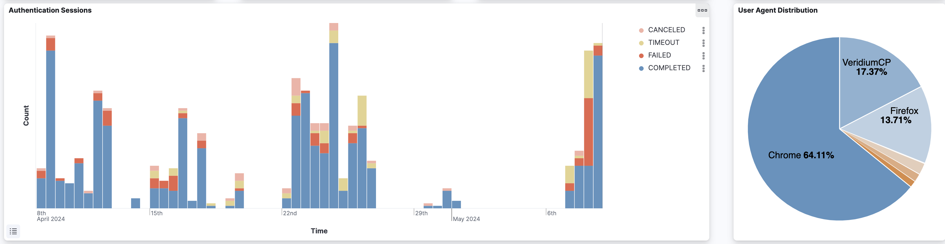
Authentication sessions bar chart which provides an overview in time of the number of authentication sessions created, classified by their outcome
-
The User Agent Distribution chart is a pie chart which shows an overview of how many authentication sessions were created using each user agent.
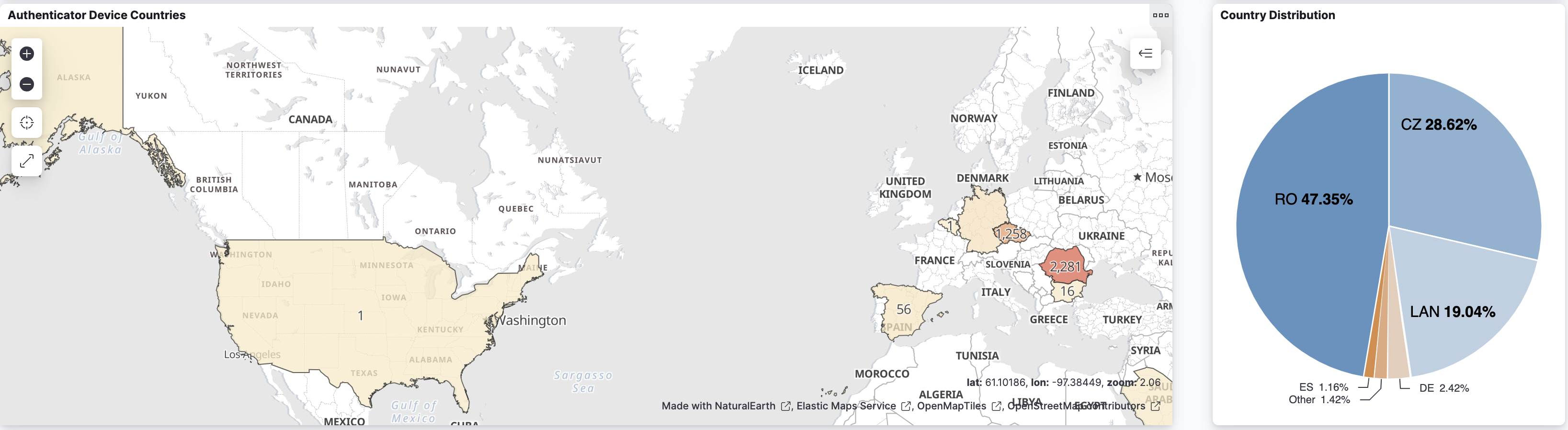
Authenticator Device Locations
This part contains two charts:
-
A country map of the sessions based on the location of the authenticator device
-
A pie chart containing the country distribution of the authenticator device location for each session
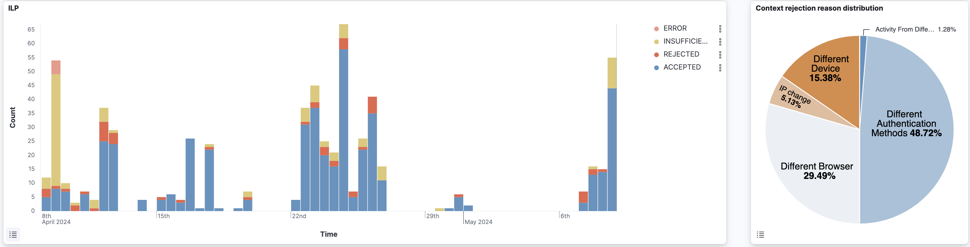
ILP charts
This part contains two charts:
-
The ILP answer bar chart, showing the ILP outcome for ILP enabled sessions
-
The context rejection distribution, which is a pie chart taking into account only sessions with ILP context rejected and showing the reasons for this rejection
Phone sessions charts
This part focuses on authentication sessions done by phone and contains the following charts:
-
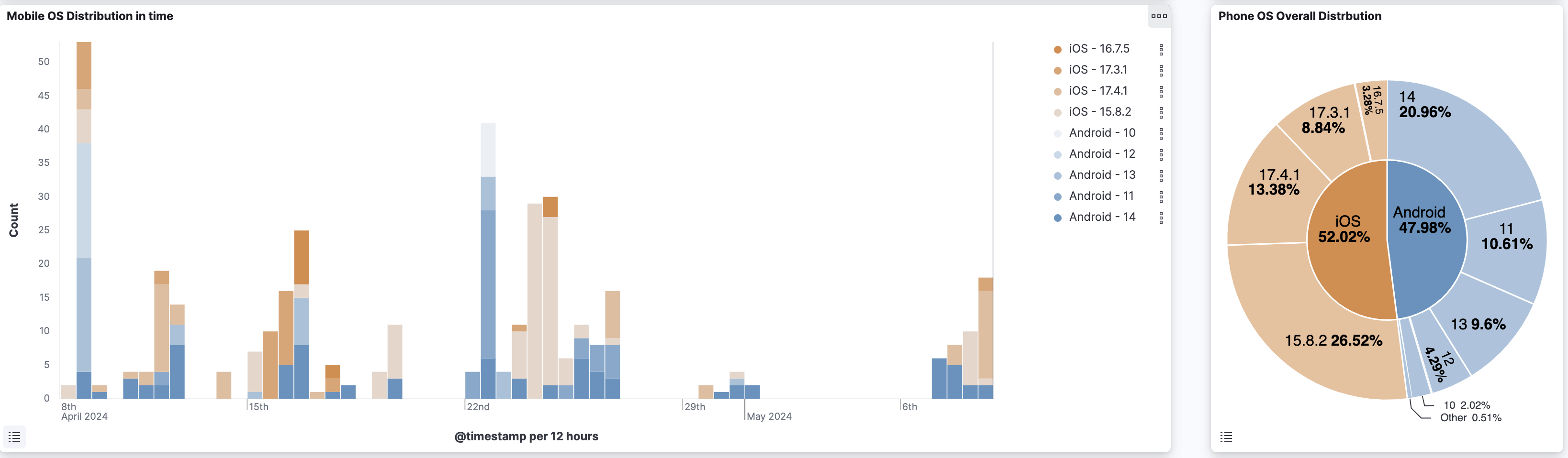
The Mobile OS distribution in time, which is a bar chart showing the count in each time interval of the 5 most frequent Android and IOS versions used
-
The Phone OS overall distribution is a multi-layer pie chart showing the total session count per OS name and version
-
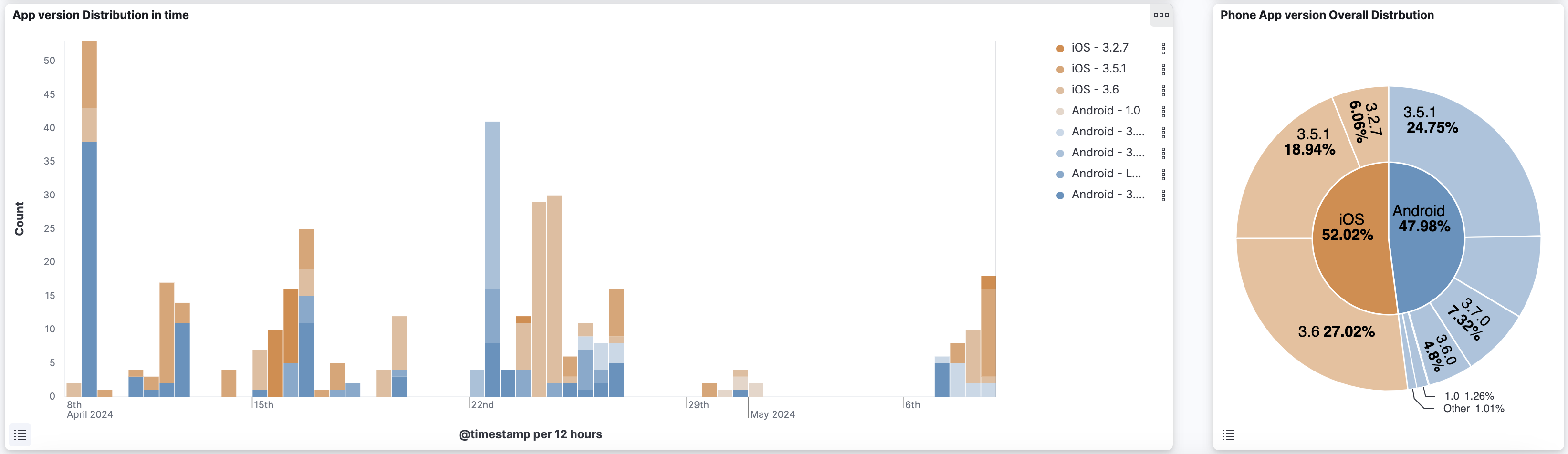
The App version distribution in time is a bar chart showing the count in each time interval of the 5 most frequent Android and IOS Veridium App versions used
-
The Phone App version overall distribution is a multi-layer pie chart showing the total session count per OS name and Veridium App version