Overview
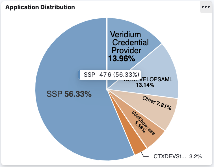
Pie charts are a type of chart that show an overview of the number of authentication sessions classified by different criterias. For example, the Application Distribution chart shows how many sessions were created using each application. Each slice represents one application and the percentage of sessions done with that application is shown.
When moving the cursor on the top of a slice, a tooltip containing the session count appears.
Filtering
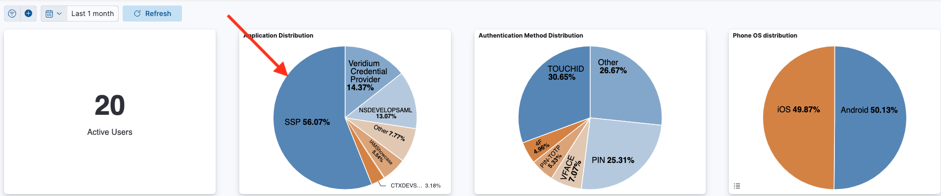
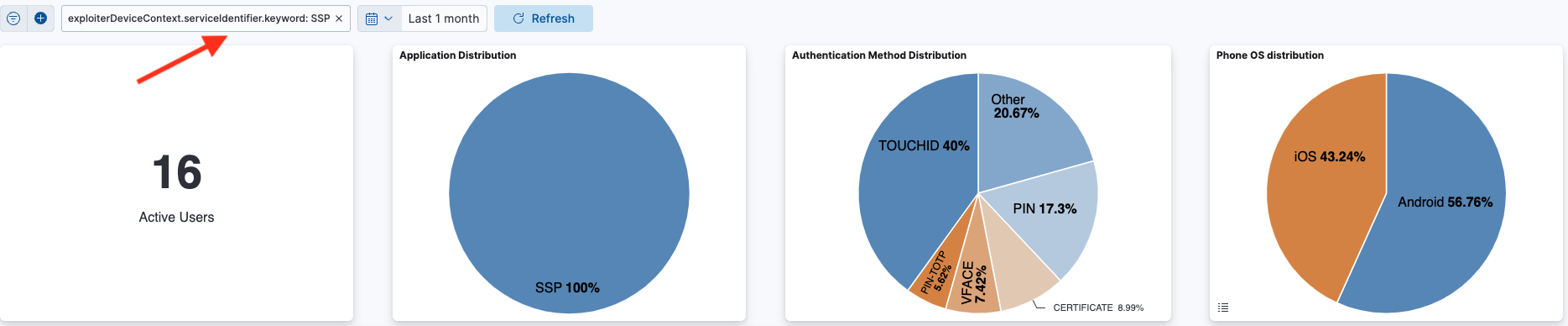
When clicking on a slice, a filter that takes into account only sessions present in that slice is applied over the whole dashboard (meaning it is also applied over the other charts in the dashboard).
The “Other” slice
The pie chart will show a limited number of entries (usually 5), starting from the ones with the largest session count. If the number of entries is bigger than the predefined limit, the rest of them are grouped in a separate slice called “Other”. The user can expand the “Other” slice by clicking on it. Doing so will result in a dashboard filter that excludes the existing slices in the pie chart.
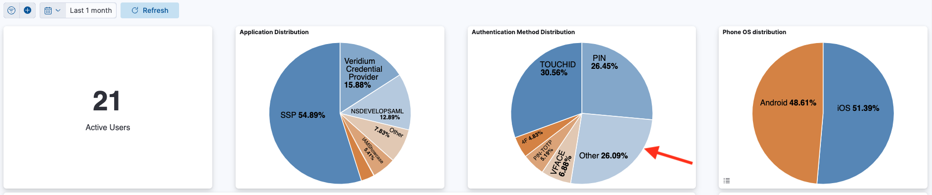
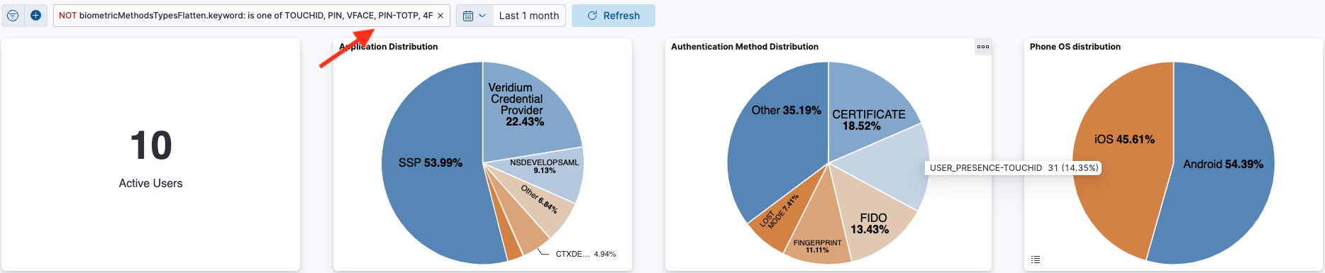
If, after expanding, there are still more entries than the limit, the remaining slices will be grouped again into an “Other” field.
Multi-layered pie charts
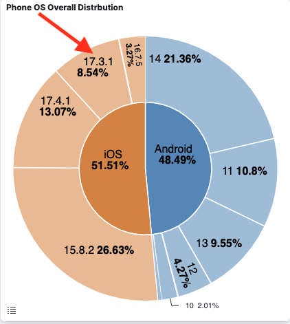
Pie charts can be also represented on multiple layers, such as the pie chart showing on the first layer the distribution of authentication sessions over the Phone OS device, and then further expanding on the second layer depicting the distribution of authentication sessions on each version of that OS.
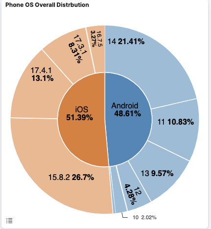
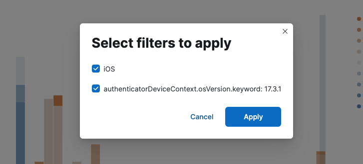
Also, when filtering on a slice on the second layer, the user may choose to filter only on that condition, or to include a filter that covers also the first layer.
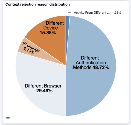
Non-Mutually exclusive slices
The majority of the pie charts have mutually exclusive slices. For example, the Application distribution chart presented above can’t have the same authentication session present in multiple slices (because each session corresponds to a single application).
However, there are pie charts which don’t have mutually exclusive slices. For example, the Context Rejection Reason distribution may contain the same session in multiple slices, because a session may contain more than one context rejection reason. The percentages are computed by counting for each rejection reason the number of sessions which contain it, and then obtaining a distribution based on those numbers (even if there are sessions which appear in more than one rejection reason slice).