
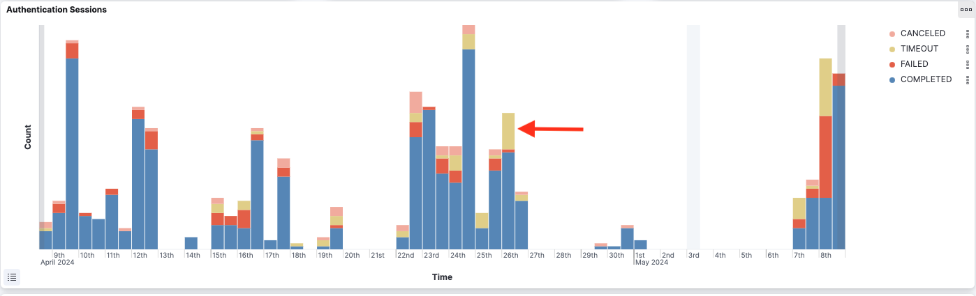
Overview
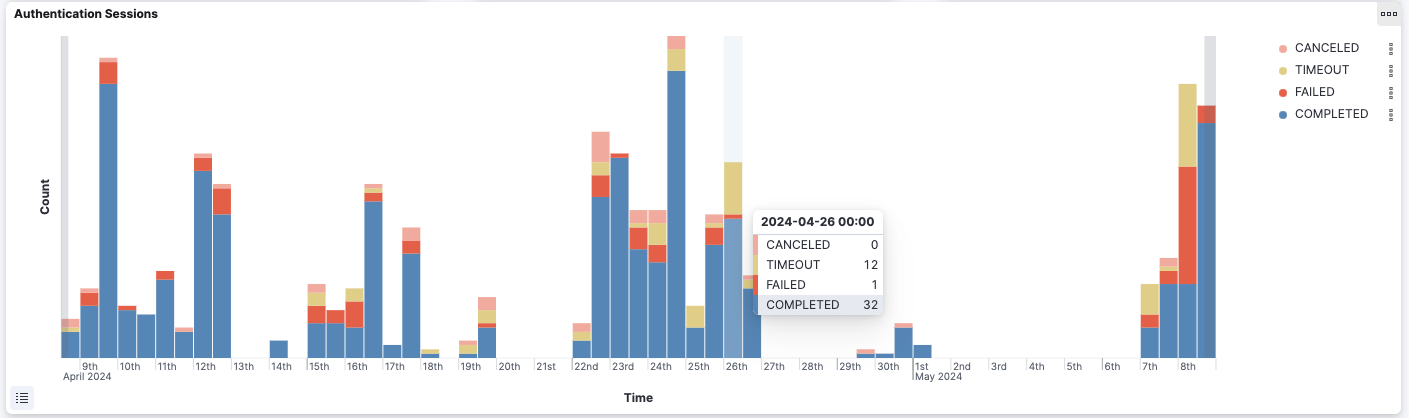
The bar charts show a count over time of the authentication sessions, classified by different criterias. For example, the “Authentication Sessions” bar chart shows the number of sessions done in each time interval, grouping them by session outcomes. By hovering over a bar, the user can see the session count for each group and details about the time interval.
The time intervals are computed dynamically depending on the time filter. If the time filter is up to a few days, the time intervals are expressed in hours. Otherwise, if the time filter is up to a month, the time intervals are expressed in days, and so on.
Filtering
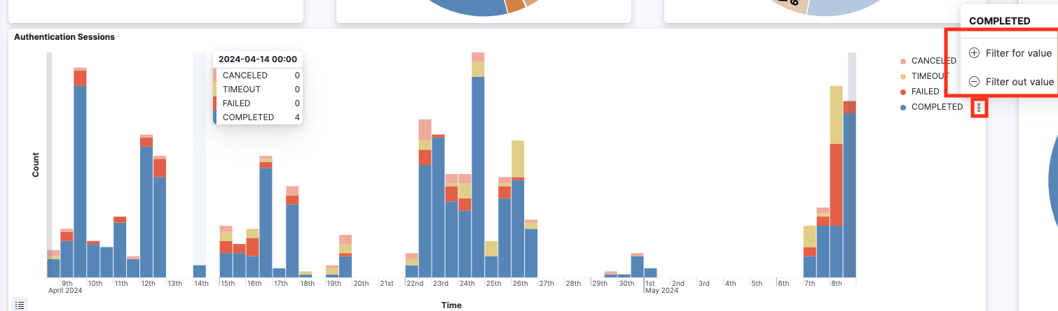
The user can filter in or out some of the groups from the legend options.
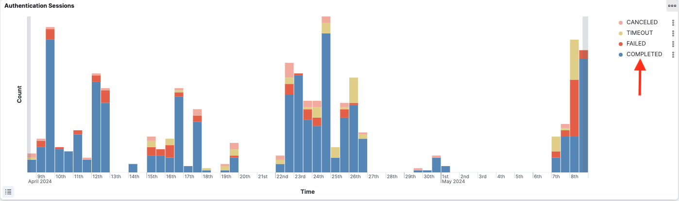
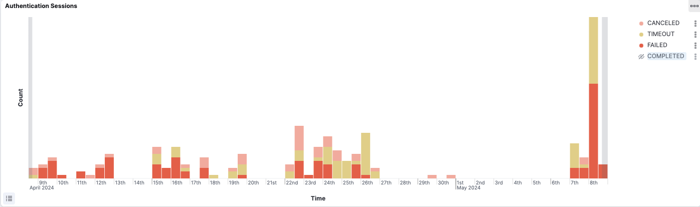
By clicking on the legend’s labels, the user can hide or show some groups in the chart (without adding any filters to the dashboard).
By clicking on a specific colored bar, the user can add a filter based on that time interval or based on the bar group. For example, when clicking on the yellow bar below, the user can either filter for the time interval of that bar, or for timeout sessions (or both).
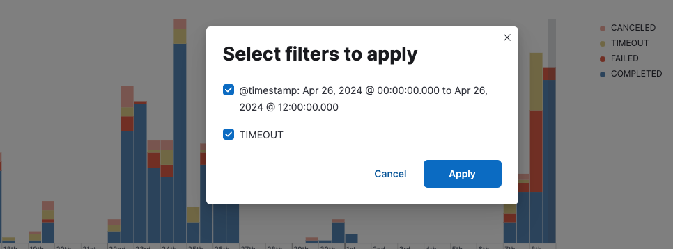
Also, the time range may be filtered by selecting with the cursor a continuous time range from the chart.