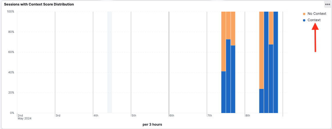
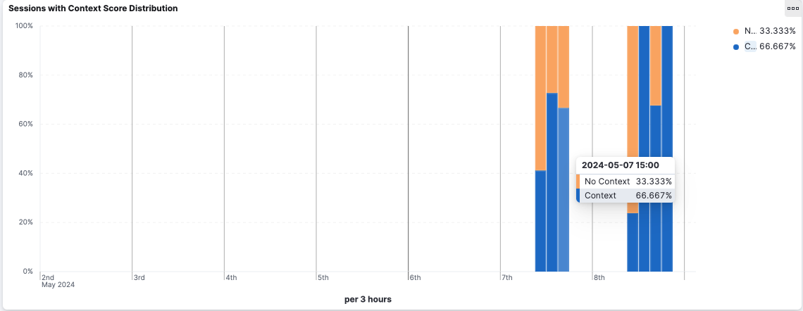
The distribution bar charts show a distribution over time of the authentication sessions, classified by different criterias. For example, the “Sessions with Context Score distribution” bar chart shows the distribution of sessions with and without context score. By hovering over a bar, the user can see the percentage for each group and details about the time interval.
The time intervals are computed dynamically depending on the time filter. If the time filter is up to a few days, the time intervals are expressed in hours. Otherwise, if the time filter is up to a month, the time intervals are expressed in days, and so on.
Filtering
The user can change the dashboard global time range by clicking on one bar.
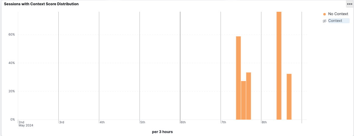
By clicking on the legend’s labels, the user can hide or show some groups in the chart (without adding any filters to the dashboard).